 |
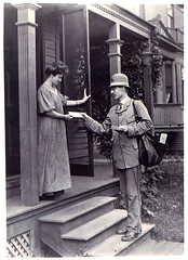
| Letter Carrier Delivering Mail (Photo credit: Smithsonian Institution) |
When the mailbox is overflowing with non-descript junk mail
and mailers from every store in a hundred mile radius, it can be hard for your
direct mail piece to stick out. If you’re finding yourself struggling more and
more to find some sort of “hook” to get potential customers engaged in your
direct mail pieces, see if any of these ideas provide a creative spark for your
next campaign:
- Give them something real. I work in the marketing world and a company that performs search engine link building sent me a piece of direct mail that you could tell included something solid. Inside was a small plastic “chain link” and an attached note that said “the first link’s on us”. The added bulk to the mailing certainly grabbed my interest and I not only opened the envelope, I called the company later that week.
- Use a sticker. Yes, something as simple as a sticker giving the recipient a call to action can greatly increase your response rate. Making a colorful, noticeable sticker that ties to some sort of requested action inside (“What rate makes you want to buy? Fill out this form on our website for information on how you can lower your rate.”) This sort of call and response marketing provides some benefit for the user to perform an action and gets them engaged.
- Go big. How can you intend to stick out when your mailing is the same, size, shape and color as everything else that comes in the mail? Invest in something bigger, whether it’s a manila envelope or something even larger. This will add to the perceived importance of your mailing piece, so make sure you give them your best on the inside to maintain that interest.
Looking for some more ideas or insight on direct mail? Check
out these links:
- · http://info.tmrdirect.com/bid/117464/7-Brilliant-Ideas-To-Bring-Your-Direct-Mail-Campaign-To-Life
- · http://www.rittersprinting.com/postal-rate-chart.php
- · http://www.entrepreneur.com/article/193436
